
Thursday, 25 March 2010


MY TREND STUFF.


NOT IN ORDER BUT THESE WILL BE THE SECTIONS FOR MY TREND. ON DIFF PAPERS, SOME ON TRACING PAPER OVERLAPPING IMAGES ETC.
JO.
Wednesday, 24 March 2010

Macro: As we start to see light at the end of the tunnel towards the economic downturn more jobs are coming into reach for the young men in the world. The need of suiting will increase and what better way of introducing these un-tailored men to a new world of tailoring that can be worn from office to party with ease in the most comfortable fashions and most refreshing colours.
Micro: Synthetics such as viscose and silk will be incorporated into the suiting creating stretch and fluidity rather than added weight for suiting that looks and appears lighter yet still has the ideal amount of structure.
Key influences: The main muse for this collection is Cole Mohr a young American model who gives a new fresh lease of life to tailoring. Cole Mohr has become one of today’s top models. He’s been the face of Alexander Wang, H&M, Marc Jacobs and Thomas Burberry, while magazines like V Man and Dansk have been queuing up to get his face on their cover pages. He wears suiting in a way that young men aspire to be wearing them like an out of work and into the hottest bars sort of look.
Trend: The future for menswear tailoring is Movement for 2011 and onwards, This allows the male form to move freely in a fashion structured fitting suit. Name: To refresh the world of tailoring with passion. The new tailoring turns serious clothing into ones of ease and enjoyment. The new tailoring gives citywear a chic sophisticated boost of stretch, lightness and comfort. Name: will give tailoring a new edge with the added stretch giving a new skin to suiting. If you are’ going to do tailoring, firstly, erase the idea that they are only office/occasion attire, and have to be restricting in its movement, but in fact embrace that ideal that they should now be the staple and core of a mans wardrobe. Make use of soft, light weight fabrics and fuse them with a classic tailored silhouette or alternatively go for a more contemporary aesthetic by mixing styles. The new tailoring will have dynamic fluidity through both silhouettes and fabric construction, synthetics and stretch add density yet without adding weight giving it a new degree of structure. "The moment calls for timeless rather than seasonal fashion."
Colour: The colours of this trend will be fresh and subtle not block colours. From natural hues to crisp greys this trend will give any man a spring into his step and his wardrobe. The colours will be easily worn and will compliment array of skin tones.
Texture: The texture of this new tailoring will be light yet structured using base materials such as cottons, silks and linen perfect for the months through spring summer.
Relevant to Topman Design: This trend could be incorporated into the Spring/Summer 11 Topman Design collection with using some of the details put forward.
· The muted colour palette could be used in their collection.
· The flexible stretch technique in the tailoring could be used to give comfort and movement.
· The lightweight cottons could be repeated into their collection.
· Small details could be created within the tailoring to give an expensive view on the collection.
heres mine guys still thinking of names x
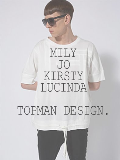
mily
still need a name!
As Spring/Summer 2011 approaches a sense of optimism follows. Enlightening and uplifting patterns, prints and hues are expected for next year with a more organic and natural feel, which softens masculine tailoring. Strong influences from India and the Middle East are brought in with an energetic surge creating a bridge between the luxurious and the playful. Continuing the current themes of escapism and tribal and safari influences and travelling east for a richer, brighter 2011.
Autumn/Winter 2010/11 struggles through the economic downturn with bluey sea greys and dusty greens so spring summer gives an uplifting turn around with an exotic and experimental palette. Hues with cultural attitude are brought in from punchy corals to midnight blues, artificial meets organic for a fusion of the striking palette. Skins tones of beiges and browns remain to be strong masculine base hues and tones, brought alive by the opposite end of the spectrum.
A casual approach will be taken for spring summer 2011, with relaxed tailoring much like that of s/s’10’s Richard Chai and White Line. A soft, elegant silhouette will be formed with the use of lighter fabrics of knits and rustic cottons allow multi layering for ample movement and comfort. Dreaming of the Indonesian beaches, details of washed out wood for buttons and haversack buckles are the finer points of this trend. Back to basics and back to nature will be a theme for the detailing and components of the trend. These details follow onto the accessory range too, with the oversized man bag continuing to be a major feature for men’s wardrobes.
Key influences for this trend thus far has been Etro with an extrovert and bold colour palette and collections bustling with patterns and prints. Matthew Williamson too explores the vibrancy of a menswear collection taking influences from women’s ethnic prints and patterns.
An eclectic mixture of sizzling graphical patterns will compliment the refined discretion of the silhouette creating an energized yet sophisticated look for the 2011 man. Strong graphical prints that have been seen in 2010 from designers such as Poltock and Walsh, Versace and Gucci will be given some rich, cultural heritage to give a more authentic and opulent feel with a surge of energy.
Pirates of the Caribbean: On Stranger Tides(2011) will reinforce the urge for destination and exploration whilst eastern styles of Slumdog Millionaire(2008) will be reminiscent and influential.
Practicality is an essential aspect of this trend. Following on from strong military trends which have been a prominent 2010 look, detailing in pockets and linings will be provided to suit the modern day man. Traveler with an urbanite contemporary lifestyle is the tone of the look.
JO:TREND
Life’s a Breeze: The New Nautical.
In terms of fabrics, Life’s a Breeze rebels from the ordinary with an air of confidence, with durable cottons dominating, layered with silks and linens for a defiant look.
GOT A LOT OF PICS/COLOUR PALETTE TO ADD IN BUT TAKING TO LONG TO LOAD ON HERE.
NEED TO ADD ABOUT HOW TOPMAN DESIGN COULD BE INFLUENCED.
NOW GOING TO WORK. MESSAGE ME WITH ANY SUGGESTIONS AND WILL READ WHEN GET BACK. :)
JO.
IDEAS


 Heres a few layout ideas that I thought were quite cool?
I thought maybe we could have one similar to these..an a5 card that has the trend written on with the name (e.g. lifes a breeze), a picture, a colour palette and maybe fabric samples or patterns?
And then another a5 card for the macro/ micro trends.
And then another a5 card for how it would relate to topman design?
So 3 in total which could all slot in to the envelopes.
This might be quicker and easier than us trying to make moodboards and stuff?
Let me know what you think.
Kirsty x
TITLE.

LIKE THIS FONT FOR MY TREND TITLE:
WHAT DOES ANYONE THINK?
THE PERSON BELOW ME, WHO ARE YOUU? I LIKE THE BOTTOM FONT OF YOURS :)
JO.
Tuesday, 23 March 2010


Friday, 19 March 2010


Thursday, 18 March 2010


TO DO...
There is still quite a bit of the powerpoint that need editing and more to be added.
- Your slide on the brandzine...the font needs to be changed to make it consistent with the rest of the presentation. also, is that the front of the magazine/website? i think it needs to be made more clear of whether there is a website or just the brandzine?..places to turn the page/page numbers ect. just more visual detail of what it will actually look like on the consumers computer.
- On your statistics slide, the font needs to be changed. make sure it's 'go long' or 'lane narrow'
- When you talk about your promotion (the projection) are you putting another slide with that?
- Do you have a slide to go with your competitors at brand level?
im kind of worried that you might not have enough slides to tick off all the points of your brief
Thaaaaanks guys
mily


Tuesday, 16 March 2010
QR CODE SLIDE.

THE PICTURE OF THE STICKER WILL HAVE A LINK ON IT TO THIS VIDEO. CAN PLAY THE FIRST 40SECS OF IT WHILST TALKING OVER THE TOP TO DESCRIBE THE IDEA.
JO.


Monday, 15 March 2010
competitors

 starting point...more can be added
let me know if anyone wants this changed...
slide for research-magazines and newspapers
slide for competitors
Ok so my trends from premier vision it was a/w 2011:
Dandy-
(slightly heritage)
macs
fitted tailoring
natural tones
Utility-
(again slightly heritage)
pockets
work men influence
City Trapper-
tweeds
checks
Oracle-
Think paul smith and liberty
british heritage
knitwear
City wear-
structured
suiting
Bit vague as i got shouted at but things can be expanded.
Lucy x
Sunday, 14 March 2010
SO.
AN IDEA.
A FOLD OUT STICKER, PLACED IN BARS/ COOL PLACES/ OXFORD STREET. CAN BE PEELED OFF EASILY AND TAKEN HOME/ PHOTOGRAPHED TO USE ON THEIR MOBILES ETC.
ON THE OUTSIDE FOLD, A QR CODE IS THERE WHICH WILL LINK TO THE BLOG/BRANDZINE.
ON THE INSIDE OF THE FOLD, AN AUGMENTED REALITY CODE WHICH WHEN PUT UP TO A WEB CAM WILL HAVE A VIDEO OF THE COLLECTION/ INTERVIEW WITH DESIGNER/ LIFESTYLE VIDEO WHICH (A KIND OF FEEL LIKE THE SEPTEMBER ISSUE) TO FURTHER COMMUNICATE WITH THE CONSUMER.
THIS WILL BE A INNOVATIVE WAY OF ATTRACTING NEW CONSUMERS/ W.O.M BUZZ AROUND THE BRAND.
JO.
heres another demo:
DEMO OF AUGMENTED REALITY.
MORE EXAMPLES OF IT.
INSTYLE MAGAZINE USED IT FOR THE FRONT COVER OF THEIR MAG IN DEC 09.
http://www.youtube.com/watch?v=FuixRZOcsDE&feature=related
JO.
TECHNOLOGY.
hi guys.
just realised the technology thing i meant wasnt a QR CODE, its actually called Print 2.o/Augmented Reality and something that HP claim to have developed to "save" print magazines.
this is it on the red bull site.
so basically the consumer puts the mag up to the screen with the "red bull eye" on and more of a story comes up for them to read/ videos/ more info that only can be shown on the net, on the actual pages of the print magazine....
The RED BULL magazine editor dives into more autophilia:
PRINT GOES LIVE
It’s not often that a magazine can call itself revolutionary, but we’re delighted to say this one can.
This very issue of The Red Bulletin takes us from print to Print 2.0, thanks to the incorporation of some nifty software known as ‘augmented reality’…the fun stuff is this: simply by holding the mag up to a computer you can take it ‘beyond the page’ and into the world-wide web. So, for example…[the cover] will link through to a video package explaining exactly how augmented reality can enhance your reading experience in a way you almost certainly never imagined, with music, film, animations and more.
Then turn to page 5 and Red Bull Air Race ace Paul Bonhomme will give you an ‘as live’ introduction to the magazine and the world of augmented reality. Head to our Now and Next pages, find the story about Black Gold on page 20 and do the same again with the mag. Lo, you’ll
find the band’s latest video on the website. Clever, eh?
Further in, you can read about Burcu Cetinkaya and Cicek Güney – the girls putting the glam into rallying – then link to exclusive interviews with them and videos of them driving flat-out… and crashing!
And we’re not done yet, no way. Our Reggie Bush cover story, on page 48, combines with an exclusive mini-movie of Reggie at home, as he talks to correspondent Jan Cremer, while page 62 will take you right into the pocket-rocket world of the Red Bull Rookie motorbike racers.
No other magazine has ever tried anything like this, and we have plenty more ideas for the future. But for now, just get your magazine and computer primed and prepare to be amazed…
watch the demo here:
think this will be so much more interesting for the topman design consumer, like a video of the catwalk, a lifestyle video, a member of the designer for topman design talking about the influences of the trends etc.
also relates to movement.
what do you think?
JO.
Wednesday, 10 March 2010
from the catwalk
this is for both the trend briefing and the topman design competitors.
i had a close look at the 2010 LFW menswear collections and these seem to be the big players.
i put their wesites up and a screen shot as it might help us with layout, get some inspiration and see how mens collections are presented and marketed.


Subscribe to:
Comments (Atom)